InkjetHelper.com
G&G Inkjet Canon Carts
And NEW INK SHOOTOUT
September, 2007
|
There are cheaper inks out there--- but I don't use them. Period. Why?..... read on.... For the latest most comprehensive test see INK TEST SHOOTOUT PAGE
G&G makes the best matching color ink to Canon OEM inks that I've found (outside of MIS bulk ink for refilling your own carts or used carts. MIS PRE-FILLED carts use a different formula than their bulk in by the way.) In fact, I have not found another brand of pre-filled discount aftermarket carts that I would even consider using for my printing. I print tens of thousands of documents, color book covers, and CD labels each year, and accuracy and color matching to original quality Canon carts is of great importance to me.
************ The test below will be moved to the INK TEST SHOOTOUT PAGE in a few days.. Today, I did a new aftermarket ink shoot out for Canon BCI6 inks, and the results are below- so, as long as you can get the dependable new cartridges of G&G ink, its a no brainer- they make the best ink of the three I tried. I began my test using G&G, Procolor, Arrow, and BPI. Unfortunately I ran out of a couple of colors on the Arrow ink, and wasn't able to complete all tests with Arrow, so I've left the Arrow results out. It may be good also- but at this point, no opinion here.
I compared
three inks, G&G, BPI, and Procolor in 3 Canon i960
printers on various papers and settings, using various
test images.
I switched the inks between printers
to detect if any one printer was problematic, and found
that they all worked uniformly. Any problems with any
ink remained regardless of the individual printer
used.
I'll be posting the results as
images on my web site later this week.
As you know, I have no financial or
political stake in preferring one brand over another.
My task is simply to find- and then use for my business
the ink that prints the best overall on CD labels
(photo matte paper), color plain paper documents, and
color book covers (photo paper).
I very much appreciate the feedback
and help I've recieved from everyone.
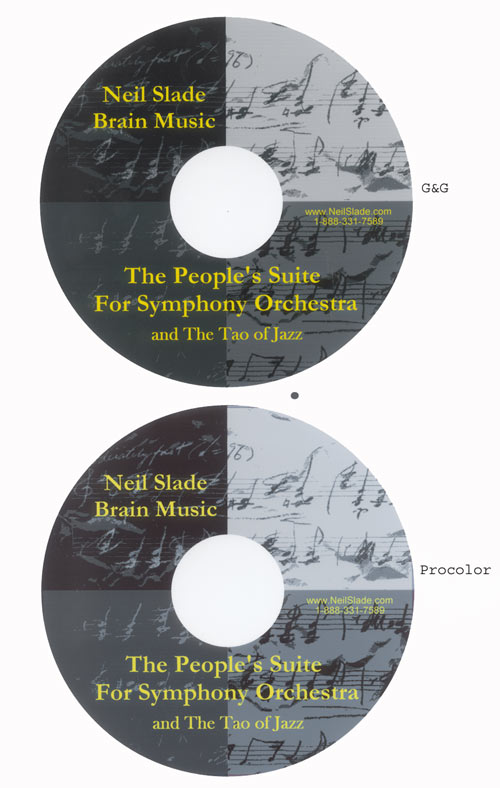
I ran the test using a CD label that
had four neutral shades of gray on it, printing on
plain paper- plain Canon profile, then on matte paper
using both a plain and matte paper profile, and then on
photo paper using a photo paper profile and the highest
quality settings. If color problems arose, I
alternatively used an "improper" profile to see if this
helped.
Papers
used:
Xerox plain paper,
24 pound, 100 brightness
Fellowes Matte Photo
Quality CD label paper (this is exceptionally good
stuff)
Kirkland Heavy
Weight Professional Glossy Photo Paper (again, really
good stuff- rumour has it than Ilford makes this for
Costco)
The Canon profiles
simply apply different levels of ink depending on the
media, to match the media's absorbtion quality.
My ratings simply
reflect accuracy of color, or gray neutrality in
relation to the original image.
After Market Ink RATINGS:
#1 Best Overall: G&G
#2 2nd Best Overall: Procolor
#3 Last Place: BPI
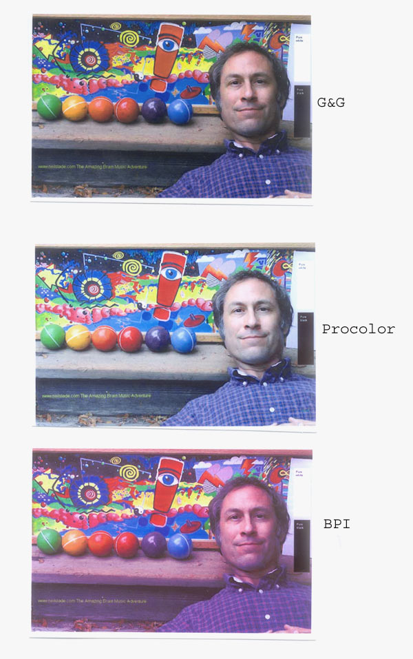
Bear in mind, the photos below are only accurate on your computer in regards to how accurately your computer monitor is set up. The best way to judge (as I did) was looking in person at the actual prints. The photos below, however, should give any internet visitor a pretty good idea how these compare.
DETAILS
G&G-- This was pretty much a
no-brainer once you lay out all the prints next to each
other. G&G worked satisfactorily, or
excellent with all types of paper- plain, matte,
or photo using the proper default Canon profiles for
each- as used for Canon OEM ink.
Plain paper using the
default plain paper profile:
Neutral Grays: Although the neutral
gray tones had a very slight tinge of red compared to
the other two inks, it was relatively minor, and only
noticable when there was no other color besides gray in
the print.
Colors- When printing a full color
photo on plain paper, it was the clear winner- vibrant,
deep, and accurate. This was more impressive using an
actual photo with skin and real objects. One might miss
how much better this was just from a color chart
profile.
Matte paper using the
default matte paper profile:
Neutral Grays- When using the
default matte paper profile, G&G was good and
acceptable, with a very slight cyan/green tinge.
Colors- Very good.
Photo paper using the
default glossy photo paper profile:
Neutral Grays: Excellent, and
clearly the best of the three inks. Neutral in light
grays, a bit of green/cyan in the mid tones.
Colors- Excellent, again, the
best.
****
Procolor-- Overall, a good ink, and best when
printing on plain paper. On matte or photo, clearly not
as good as G&G, On photo paper, its a washout,
literally. HOWEVER, if one judged color by ONLY looking
at a color chart, you might be fooled. The Procolor ink
looks good on a chart-- but I learned long ago, do not
judge an ink merely by gazing at pure color charts- you
will be deceived and charts will not accurately give
you an idea of how the color works when printing
graphics or photos. My guess is that the people who
make Procolor are using nothing but charts to formulate
their ink. Bad idea.
Plain
paper using the default plain paper
profile:
Neutral Grays:
Excellent, and nearly the bestfor neutral gray on
plain paper. Very deep and nice blacks. BPI slightly
better.
Colors- Good, but
not great. Color prints of skin tones and objects are
not deep enough and lack saturation. Looks a bit
washed out. Nothing to write home about.
Matte
paper using the default matte paper
profile:
Neutral Grays- The
grays take on a pretty strong cyan tinge noticable in
the lighter grays. Not real great. On a color chart
looks okay- but print a graphic, and you see
tinge.
Colors- Looks good
on the color chart
Photo
paper using the default glossy photo paper
profile:
Neutral Grays:
Better results than on matte paper, but still a
tendency towards cyan/green in light, and mid
tones.
Colors- Not very
good really, unacceptable. The plain paper color is
much better. Washed out.
****
BPI-- At first I thought this stuff was a winner---
using plain paper. Looked good- then I tried
this ink on matte and photo paper. Unbelievably
bad.
Plain
paper using the default plain paper
profile:
Neutral Grays:
Excellent, no doubt about it.
Colors- Good,
but not great. Not deep or saturated enought, the
black was not deep enough, skin tone on the red
side.
Matte
paper using the default matte paper
profile:
Neutral Grays-
At first I thought something was wrong with my
printer. So I switched printers- totally off with
massive magenta/purple tinge. You would think the
ink carts were all screwed up. Totally totally
unusable. I switched to the plain paper profile
using matte paper- and VOILA- it looked
fantastic. The most accurate and best of all!!
So, the best ink on matte paper- providing you
only use the plain paper profile.
Colors- Again,
using the matte paper profile, so BAD you
wouldn't believe it. Use the plain paper profile-
the color chart looked GREAT!
Photo
paper using the default glossy photo paper
profile:
Neutral Grays:
Whoever is doing the color formulation at BPI
needs to be fired, period. This is
outrageous.
Colors- Fire
the color guys, now. So red-- its like SUNBURN.
And switching to plain paper profile with photo
paper doesn't help. BPI is unable to print on
glossy paper, period. It's not my paper either,
Canon ink looks FANTASTIC on Kirkland paper, on
Fellowes Matte Paper, as does G&G.
So there you have it.
|
Okay! Now please visit THE AMAZING BRAIN ADVENTURE
|
The AMAZING BRAIN ADVENTURE's MOST POPULAR PAGES:
Your Amazing Brain Adventure is a web site all about Tickling Your Amygdala- i.e. turning on the best part of your brain as easy as clicking on a light switch. This is done as easily as imagining a feather inside of your head stimulating a compass, the amygdala. The amygdala is a set of twin organs, a part of your brain that sits right in between the most advance part of your brain- the frontal lobes and pre-frontal cortex- and the most primitive part of your brain- your "reptile brain" and brain stem. By tickling your amygdala you instantly and directly increase creativity, intelligence, pleasure, and also make possible a spontaneous natural processes known as "paranormal abilities", although such things as telepathy and ESP are really as natural as breathing, or as easy doing simple math in your head. The ability to self stimulate the amygdala by something as simple as thought has been proven in laboratory experiments, such as those conducted at Harvard University research labs, 1999-2009, and can be tracked with modern brain scanning machines such as fMRI and PET... Indeed, thought is faster than light.
Other sites of interest: EasyPaintYourCar.com is a painting site dedicated to learning how to paint a car yourself, even if you've never painted a car before. You can refinish your car to professional standards at home, better than if you take it to someone else, and enjoy doing it at a fraction of the cost of having it done in an expensive shop. You can repair dents, rust, and use the most durable real automotive paint, and even learn to apply it without any special or expensive gear, in a safe and enjoyable manner. Paint your car in your garage, car port, or even driveway. You can spray, use an HVLP gun, or even use a roller.
Easy Make A Kindle and Your Own Publishing are sites about self-publishing and writing, and how any person can publish materials, print, online, and electronic books. You can drop out of the corporate slave labor rat race and own your own life by writing and distributing your own books on the subject that you know best.
InkJetHelper.com is a web site about escaping from the ridiculous cost of ink jet printer ink refilling- and refilling your printer for pennies instead of $70 a shot. It also has useful tips about maintaining ink jet printers, especially Canon brand printers.
Julia Lu Painting is all about the creative works of Chinese painter Julia Lu, a modern master of oil and water color painting. Julia shares her creative secrets, ideas, as well as her art work.
Off-site links Neil on Lulu Car On Lulu Tribe Blogger Wordpress Cookbook Space PaintWordpress Tripod 2 Google Wands Amazon B&N Kindle Facebook Linked GooglePlus Coast2Coast Viewzone YouTube 2 Blogtalk 1 2 3 4 5 6 7 8 9 1 2 3 4 5 6 7 8 9 1 2 3 4 5 6 7 8 9 1 2 3 4 5 6 7 8 9 a b c d e f a b c e f g h i 8 7 6 5 4 3 1 2 a b c d e f g h i a b c d e f g h i j k l m n o p q r s r u v w x y |
